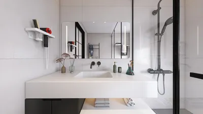


What is the most common core problem in Peranakan style design?
The most frequent issue is the imbalance between intricate patterns and harmonious color coordination.
Quick Takeaways
1. Overuse of patterns leads to visual chaos. 2. Mixing incompatible colors dilutes the authentic charm. 3. Ignoring proper scale disrupts spatial balance. 4. Confusing Peranakan motifs with other styles weakens identity. 5. Poor material choices compromise texture authenticity.
Introduction
When I first embraced Peranakan style in my designs, I quickly realized how easy it is to misinterpret its rich decorative heritage. The style’s beauty lies in its intricate tiles and vibrant palette, but without restraint, these elements become overwhelming. Designers often struggle to find the sweet spot between ornate detail and spatial harmony, which can easily lead to a cluttered or confused interior. This article draws from hands-on experience and detailed observation to clarify the typical missteps and guide you towards an authentic Peranakan aesthetic.
Why It Goes Wrong
The root of failure in Peranakan design is usually the failure to balance ornamentation with space and color. Being a style that thrives on visual complexity, it requires a delicate hand to avoid over-decoration or stylistic confusion. When the proportions of pattern, color intensity, and spatial arrangement are neglected, the intricate details become a source of clutter rather than charm.
Mistake 1: Overwhelming Pattern Saturation
The Mistake: Filling every surface with Peranakan tiles or motifs, creating sensory overload. Why It Happens: Designers get enamored with the style's detailed patterns, believing more is better to showcase authenticity. The Fix: Use patterned tiles strategically as feature areas, limiting coverage to no more than 30-40% of the total wall or floor surface to maintain balance and allow visual breathing space.
Mistake 2: Clashing Color Schemes
The Mistake: Mixing multiple vibrant, saturated colors without a cohesive palette. Why It Happens: Peranakan style has a rich color vocabulary, and beginners often mimic this by piling on every shade seen in traditional motifs. The Fix: Select 2-3 dominant colors from traditional Peranakan palettes—typically blues, reds, greens—and complement them with neutrals to unify the scheme and prevent visual chaos.
Mistake 3: Disproportionate Tile Scale
The Mistake: Using tile patterns that are either too large or too small for the space, leading to imbalance. Why It Happens: Lack of attention to room dimensions and the scale of tile patterns relative to furniture and architecture. The Fix: Match tile size to room scale, opting for medium-scale patterns in living areas to anchor the space and smaller, delicate tiles for accent areas like backsplashes or niches.
Mistake 4: Style Confusion with Other Asian Motifs
The Mistake: Incorporating Chinese or Malay design elements that conflict with traditional Peranakan imagery. Why It Happens: Misunderstanding the unique identity of Peranakan style, which blends but does not conflate its cultural influences. The Fix: Study classic Peranakan art and motifs carefully, focusing on specific flower, geometric, and color motifs that define the style, avoiding generic Asian design elements.
Mistake 5: Ignoring Material Texture Authenticity
The Mistake: Using cheap or glossy materials that flatten the texture expected from handcrafted tiles and furnishings. Why It Happens: Cost constraints or a lack of sourcing knowledge lead to substitutions of authentic ceramics with plastic or laminated finishes. The Fix: Prioritize textured, hand-glazed ceramic tiles or high-quality printed reproductions with matte finishes. Pair with wood or rattan furniture to maintain tactile richness.
Designing the Look
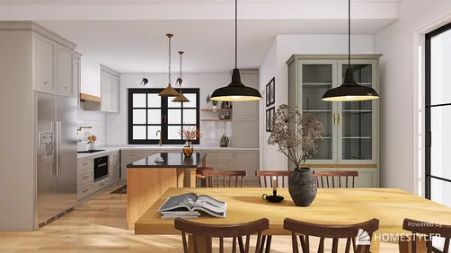
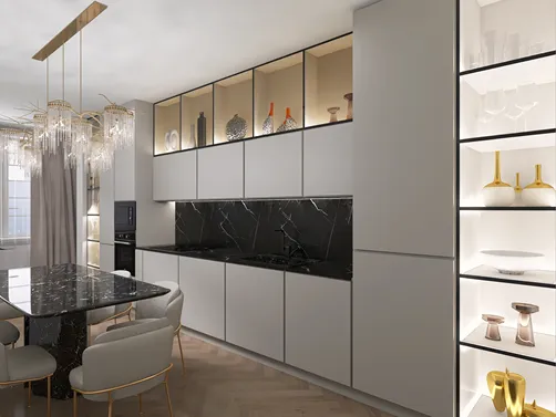
Homestyler’s ‘Peranakan tiles’ offers a comprehensive set of ready-to-use 3D models specifically curated to embody this aesthetic, allowing designers to achieve authentic results with professional-grade textures and forms.

kitchen cabinet set-Kitchen Cabinet III

kitchen cabinet set-Kitchen Cabinet III

dining table set-Modern Home Interior

kitchen cabinet set-Kitchen Cabinet III

bookcase-Country Grace

kitchen cabinet set-Kitchen Cabinet III
FAQ
Q1: What are the defining features of Peranakan tiles?
Peranakan tiles are characterized by their intricate geometric and floral patterns, vivid color schemes—commonly blues, greens, reds—and glazed ceramic finish. These tiles often feature symmetrical designs influenced by Chinese, Malay, and European motifs, making them visually distinct and culturally rich.
Q2: How can I mix Peranakan style with modern interiors without losing authenticity?
The key is balance. Incorporate Peranakan tiles selectively as focal walls or floor features while using minimalistic modern furniture and neutral surroundings. This contrast highlights the style’s ornate beauty without overwhelming the space. Avoid over-accessorizing and choose colors that complement rather than compete.
Q3: Are there sustainable alternatives for authentic Peranakan tiles?
Yes. Many manufacturers now offer eco-friendly ceramic tiles made from natural clay with low VOC glazes. Additionally, digital printing technology enables high-quality tile reproductions with reduced environmental impact. Always check sourcing information and prioritize suppliers that emphasize sustainability and craftsmanship.
Homestyler's roots trace back to Autodesk, the global leader in design and engineering software. That heritage lives on in every feature we build. Today, with a community of more than 20+ million registered users (platform data, 2026) worldwide, Homestyler continues to make professional-quality interior design accessible to everyone — from first-time decorators to seasoned architects.
Homestyler is a professional interior design software that helps users effortlessly create their dream home.
Projete agora para LIVRE







![Design [4]](https://hs-designs.homestyler.com/production/design/images/07c2de3a-88ec-4be8-8910-ff255b795bc2/1731419398293/7841697.jpg?x-oss-process=image/resize,w_502,m_mfit/format,webp)













![[For my dearest Sabrinik 🧡]](https://hs-designs.homestyler.com/production/design/images/3f463715-5ed6-4c49-9346-16d464510aa6/1714085722568.jpg?x-oss-process=image/resize,w_502,m_mfit/format,webp)
