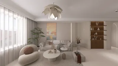


Pop Art Inspired
Pop Art Inspired aesthetics redefine spatial narratives by embracing the audacity of mass culture’s iconography, transforming everyday objects and media motifs into bold artistic expressions. Rooted in the 1950s and 60s cultural movement that celebrated the visuals of comic strips, advertising, and consumer products, this style uproots traditional interior design conventions in favor of a playful yet thought-provoking dialogue between art and living space. Rejecting subtlety and understatement, Pop Art Inspired interiors revel in high-energy contrasts and visual immediacy aimed at disrupting monotony, urging inhabitants to experience their surroundings as a spontaneous extension of popular culture. This embrace of high impact visuals and accessible symbolism fosters environments that are simultaneously nostalgic and provocatively modern, illustrating a philosophy where art, commerce, and daily life collide with unapologetic vibrancy. The hallmark of this aesthetic is its ability to blend irony with celebration, utilizing a visual language that speaks to mass media and consumer iconography through vivid palettes, graphic motifs, and exaggerated forms that evoke both humor and critical reflection within interiors.
Core Elements
Color in Pop Art Inspired interiors defies subtlety, leveraging a palette saturated with primary and secondary hues to maximize visual impact. Bright reds, electric blues, sunny yellows, and punchy greens dominate the spaces, often applied in large, flat expanses or striking geometric divisions that mimic printed comic panels. The color selections are dynamically juxtaposed to stimulate attention and invite continuous visual engagement, mimicking the visual strategies of advertising and comic book art. Strategic use of black outlines or white borders accentuates these colors further, creating a sharp definition and a graphic clarity characteristic of Pop Art printmaking techniques. Occasionally, metallic or neon accents heighten the sense of excitement and contemporary flair, echoing the material exuberance found in consumer culture and the entertainment industry. This fearless approach to color employs contrast and repetition to orchestrate compositions that pulsate with energy, reinforcing the underlying ethos of accessibility and popular appeal.
Materiality within Pop Art Inspired design exudes a glossy, often synthetic quality that mirrors the mass-produced origins of its cultural references. Surfaces are frequently lacquered or polished to a high sheen, creating reflections and intensifying the saturation of colors present in the environment. Acrylics, plastics, and vinyl dominate as materials, lending a perceptible pop and sleekness while encouraging tactile interactions that feel playful or deliberately artificial. Incorporation of commercial signage materials—such as neon tubing or printed vinyl decals—and repetitive patterns emphasize technological reproduction as both theme and aesthetic strategy. Furniture and accessories commonly exploit these versatile media, combining injection molding techniques or glossy laminates with bold silk-screened graphics to evoke the look and feel of billboards, packaging, and comic book pages. This material identity rejects natural patinas or rustic textures, instead prioritizing surfaces that appear produced, plotted, and activated for contemporary cultural consumption, effectively blurring lines between art object and functional furnishing.
Form and shape in Pop Art Inspired interiors tend toward exaggeration and iconography, embracing simple geometric silhouettes with rounded edges, oversized scale, and repetitive motifs to create an environment rife with recognizable imagery. Modular elements inspired by signage, typography, and everyday objects are often exaggerated into sculptural installations or playful, functional pieces. Furniture may include bulbous chairs mimicking speech bubbles, tables shaped like comic panels, or lighting fixtures recalling neon signage, each piece operating as both an object and a cultural reference. Forms are intentionally unrefined or hyper-stylized, drawing attention to their graphic nature and commodified status. Additionally, the use of repetition—whether through pattern, pattern modules, or serialized forms—provides rhythm within spaces reminiscent of mass media production lines. This approach to shape extends the Pop Art ethos by making each piece both literally and figuratively larger than life, shifting interior elements into realms of iconographic spectacle and everyday cultural commentary.
Designing the Look
When designing interiors inspired by Pop Art, it is crucial to balance exuberance with spatial coherence. The visual language demands both striking contrasts and a cohesive narrative to avoid visual chaos. Strategic placement of key colorful elements and sculptural pieces punctuates spaces, while neutral backgrounds can serve to ground the overall composition without diminishing the impact of bold motifs. Incorporating graphic wallpaper or mural art with repeating patterns or iconic imagery creates feature walls that act as focal points and conversation starters. Lighting plays a pivotal role: fixtures with neon accents or lampshades mimicking comic aesthetics enhance the immersive experience. Textural contrasts introduced by sleek acrylic surfaces against soft textiles with graphic prints can add depth and comfort to disruptive forms. Cohesion is further advanced through the repetition of motifs across cushions, rugs, and decorative objects, tying the environment together through a shared visual vocabulary. Selecting furnishings that combine form and function while simultaneously serving as art pieces keeps the atmosphere dynamic yet livable. In this respect, Homestyler’s ‘Pop Art Inspired’ offers a comprehensive set of ready-to-use 3D models specifically curated to embody this aesthetic, allowing designers to achieve authentic results with professional-grade textures and forms.

Minimalist Gray Solid Wood Cabinet Door Panel 3D Model

Minimalist Solid Oak Fluted Wall Panel 3D Model

Minimalist Porcelain Coffee Cup and Saucer 3D Model

Minimalist Modern Straight Staircase 3D Model

Industrial Metal Electrical Cabinet Industrial Equipment 3D Model

firewood-Spa at Home
FAQ
Q1: How can I incorporate Pop Art Inspired elements without overwhelming my space?
To avoid overwhelming interiors, use Pop Art elements as focal points rather than saturating an entire room. Employ bold colors and graphic forms in single walls, statement furniture, or lighting fixtures, supported by neutral or monochrome surroundings. Balancing intensity with calm prevents visual fatigue and maintains sophistication amid vividness.
Q2: What materials best capture the Pop Art Inspired aesthetic for furniture and accessories?
Materials such as high-gloss acrylics, lacquered wood, vinyl, and plastics embody the Pop Art look with their shiny surfaces and ability to hold vibrant colors. Neon lighting and printed vinyl decals further enhance the aesthetic by referencing industrial and commercial production methods intrinsic to the style.
Q3: Can Pop Art Inspired design work in both residential and commercial interiors?
Absolutely. Its cultural references and high-impact visuals make it ideal for commercial environments seeking to engage customers, such as cafes or boutique stores. Adapted thoughtfully, residential spaces can also benefit from its playful energy by integrating elements that reflect personal tastes while maintaining usability and livability.
Homestyler's roots trace back to Autodesk, the global leader in design and engineering software. That heritage lives on in every feature we build. Today, with a community of more than 20+ million users worldwide, Homestyler continues to make professional-quality interior design accessible to everyone — from first-time decorators to seasoned architects.
With Homestyler, you can design and visualize your living spaces online with stunning, realistic results.
Projete agora para LIVRE
































