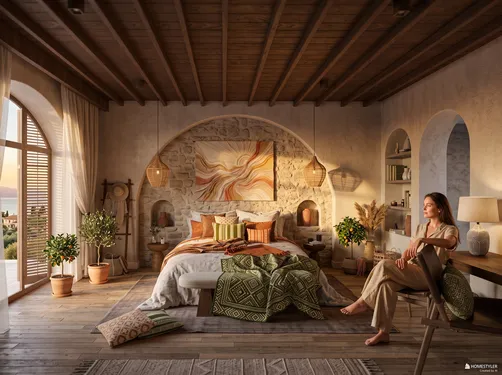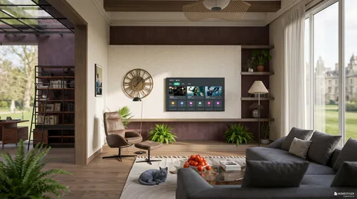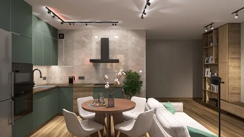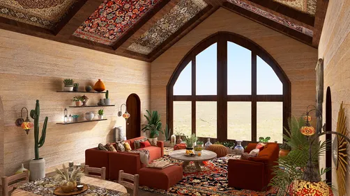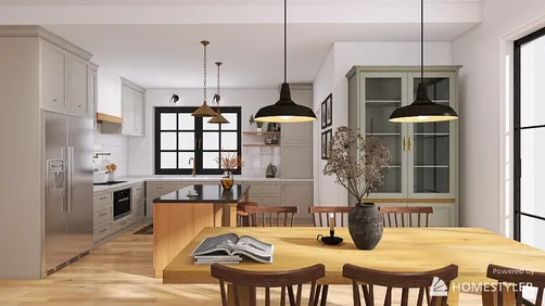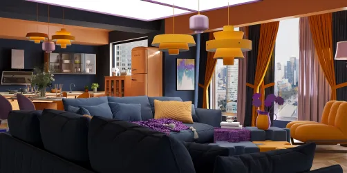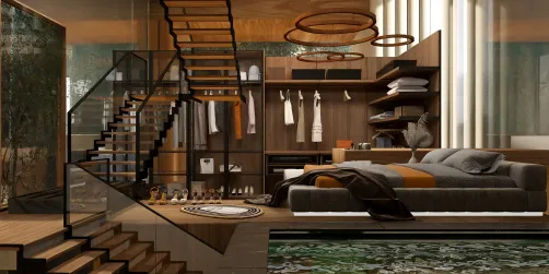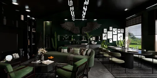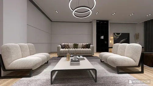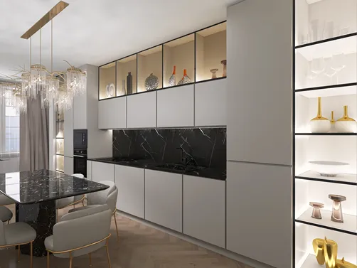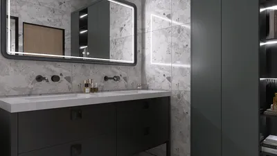


The core design challenge of the Pop Art Inspired style lies in balancing visual exuberance with spatial harmony. Unlike minimalist or neutral interiors, this style boldly embraces saturation, vividness, and playful forms, which can easily overwhelm a room if not handled with precision. At its essence, Pop Art is about high-impact color contrasts combined with graphic motifs, yet this inherently brings the difficulty of preventing the space from feeling chaotic or cluttered. To negotiate these opposing forces, designers must develop an acute sensibility towards scale, rhythm, and focal points, synthesizing boldness without relinquishing coherence. This means that every element — be it a piece of furniture, an accent wall, or an accessory — must be meticulously curated in proportion and palette to relate to one another without competition. Surfaces often become canvases that merge primary colors with black and white graphics, requiring careful layering to avoid visual fatigue. Ultimately, the challenge is not merely to fill the room with pop culture references or saturated hues but to craft an environment where energy and structure coexist. The spatial narrative must maintain flow, allowing the eye to travel smoothly from one element to the next, engaging without exhausting. Success demands an artful orchestration of pattern, color, and form that reads as playful yet purposeful, all while honoring the vivacity emblematic of Pop Art’s cultural heritage.
Step 1: Layout Logic — Spatial Proportions and Furniture Arrangement
Pop Art Inspired interiors require a composition approach akin to arranging pieces on a vibrant canvas. Start by defining your primary spatial zones with consideration to traffic flow and focal points. Bold colors and graphic elements will naturally draw attention, so position larger furniture pieces — such as sofa and armchairs — to anchor the room rather than crowd it. Use modular or streamlined furniture with clean lines to offset the visual energy of decorative elements. Consider the scale carefully: oversized items in intense colors can dominate, so balancing them with neutrals or grounded tones helps to maintain proportional harmony. Group smaller seating or side tables with playful shapes or bright finishes to create dynamic clusters that invite interaction. Use rugs or floor patterns to delineate areas but opt for geometric or pop-art motifs that unify the palette. Open layouts benefit from deliberate positioning of statement art pieces or sculptural accessories that guide movement naturally through the space. Avoid placing too many focal visual activities side by side; instead, stagger visual weight so the gaze shifts comfortably without overwhelming sensory input. Every furniture element should complement the other through size and style to align with the vibrant yet ordered language of Pop Art.
Step 2: Light and Color — Tone Selection and Source Pairing
Light functions both as a literal illuminator and a mood enhancer within Pop Art Inspired interiors. Embracing the style’s inherent vibrancy means deploying lighting that enhances saturated hues without distortion. Begin by layering ambient light using recessed or track systems with adjustable color temperature. Cooler white light suits spaces emphasizing graphic black-and-white contrasts, while warmer tones amplify primary color accents rich in red, yellow, or blue. Accent lighting spots can spotlight wall art, bold-patterned wallpapers, or iconic décor elements, deepening visual interest and texture definition. Consider integrating neon or LED strip lighting for authentic pop references, but with moderation to avoid glare or clashing colors. Walls often perform as canvases; therefore, wall washes or uplighting can reduce shadow harshness and create a uniform glow that enhances color pop. When selecting color palettes, anchor the scheme on bright primaries balanced with monochromatic neutrals such as solid black or crisp white. This juxtaposition is critical: it generates tension and clarity simultaneously. Avoid mixing too many secondary hues to keep the look cohesive. Finally, reflective surfaces like gloss finishes or lacquered items scatter light playfully, intensifying vibrance without raising visual noise levels.
Step 3: Finishing Touches — Small-Scale Models to Elevate Texture and Mood
Integrating small decorative objects with thought maximizes the emotional appeal of Pop Art-inspired rooms. Choose iconographic sculptures, oversized graphic books, and vividly patterned ceramics as key accent elements. These items heighten tactile richness and connect the narrative threads embedded in the color and shapes deployed throughout the space. Proportionally, they should play contrast roles while echoing primary motifs or color blocks. Avoid overcrowding surfaces; prioritize quality of each accessory to serve as a pop statement or conversation starter. Artwork frames and cushions provide additional layering opportunities. Select cushions with bold prints or comic-inspired designs that harmonize with surrounding colors, and opt for frames that enhance without competing — slim black or white borders work well. Placement is paramount: position small objects in deliberate clusters or isolated spots to create focal moments. Incorporate texture variety through textiles and finishes, such as smooth plastics, glossy metals, or matte ceramics, to enrich sensory depth. These objects punctuate the environment and complete the stylistic puzzle, ensuring that the exuberance of Pop Art’s energy translates into lived experience.
Designing the Look
For designers working in Homestyler, the Pop Art Inspired model is a practical shortcut to authenticity. It removes the guesswork from sourcing — every piece is pre-matched in scale, material, and proportion to deliver a coherent Pop Art Inspired result.

Modern Black Solid Wood Grid Glass Window 3D Model

Study Desk Set_3

bed-Jun.Check-in

office chair-Public Space Decor

night stand-French Style

feature wall-French Style
FAQ
Q: How can I prevent a Pop Art Inspired room from appearing cluttered given its intense colors and bold patterns?
The key is to establish a visual hierarchy through strategic furniture placement and limited color palettes. Use neutrals like black, white, or muted tones as grounding elements to break up vivid colors. Limit patterns to one or two focal areas such as accent walls or rugs. Avoid overcrowding surfaces with too many decorative items. Prioritize quality and intent behind each piece. This curation helps create rhythm and breathing space within a vibrant environment.
Q: What lighting types work best to showcase the color palette characteristic of Pop Art?
Layered lighting with adjustable color temperatures is essential. Ambient lighting with neutral white tones offers a versatile base, while directional spotlights highlight artwork or textures. Incorporate accent LEDs or neon elements sparingly to add authentic Pop Art flair. Avoid colored lights that clash or wash out primary hues; instead, enhance saturation and clarity through balanced warm-to-cool transitions.
Q: How to integrate small decorative models without overwhelming the design concept?
Choose accessories that echo the space’s main motifs—whether geometric shapes, vibrant colors, or iconic images. Position them intentionally to create focal points or clusters rather than random groupings. Vary textures among ceramics, plastics, and textiles to add sensory interest. Keep the number of pieces minimal but impactful to maintain cohesiveness and reinforce style identity.
Built on technology originally developed at Autodesk, Homestyler empowers anyone to design beautiful, realistic spaces in minutes. Join over 20+ million users who have already discovered a smarter way to plan, visualize, and bring their dream homes to life — all from the comfort of a browser.
Homestyler has millions of users worldwide, making it one of the most popular online home design platforms.
Projete agora para LIVRE