
| Room or tree style | Brown tones to try | Gold finish | Best supporting texture |
|---|---|---|---|
| Modern and minimal | Espresso, walnut | Brushed or matte gold | Smooth glass, slim ribbon |
| Cozy and natural | Chestnut, caramel | Antique gold | Pinecones, linen, wood |
| Traditional | Chocolate, mahogany | Polished gold and bronze | Velvet, bells, layered ornaments |
| Light and airy | Taupe, warm beige | Champagne gold | Sheer ribbon, cream ornaments |
A brown and gold Christmas tree feels festive without relying on the usual red-and-green formula. The combination is warm, grounded, and surprisingly flexible: think cocoa velvet beside brushed brass, or a few pinecones tucked between soft gold baubles. It can read polished and modern, rustic and relaxed, or somewhere in between.
The secret is contrast. Brown gives the tree depth; gold catches the light. Use too much of either and the result can feel heavy or overly shiny, so the best designs mix finishes and leave breathing room between ornaments. Here’s how to build a palette that looks considered, works with your existing room, and still feels like Christmas.
Why the Brown and Gold Christmas Tree Feels Fresh
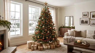
Gold has long been a holiday staple, but pairing it with brown shifts the mood from glittery to warm. Brown connects the tree to natural materials already found in a room: wood floors, leather, woven baskets, and evergreen branches. Gold adds the sparkle that makes the arrangement feel seasonal rather than simply earthy.
The palette also suits different decorating styles. In a modern room, use dark brown ribbon and a small number of smooth, reflective ornaments. In a traditional space, bring in bronze bells, pinecones, and varied gold finishes. For a softer look, choose champagne gold, cream accents, and lighter shades such as caramel or chestnut.
I like this combination because it doesn’t demand a full room makeover. A tree can pick up the color of a walnut side table or a tan sofa and still feel special. Start with the room’s existing undertones: cool gray-brown wood pairs well with muted champagne gold, while honey oak and warm beige can handle richer bronze.

Build the Look in Layers, Not Matching Sets
A tree looks more natural when its decorations have a little variation. Instead of buying a complete matching set, choose a few anchor pieces and repeat their colors in different shapes and finishes. That gives the eye a rhythm without making every branch look identical.
- Choose the brown first. Pick one main shade, such as chocolate, walnut, or caramel. Use it in ribbon, a few larger ornaments, or both. If your room already has dark furniture, a lighter brown keeps the tree from blending into the background.
- Add two gold finishes. Pair matte or brushed gold with a smaller amount of reflective gold. The contrast helps the lights sparkle without turning the whole tree into a mirror. Antique brass and champagne gold are especially easy to mix.
- Bring in natural texture. Pinecones, dried orange slices, wood beads, or simple woven ornaments make the palette feel less formal. Keep these pieces spaced out; a cluster of pinecones on one side can make the tree look lopsided.
- Use ribbon as a visual guide. A brown velvet ribbon can travel vertically in loose loops, or be tied into bows at branch tips. For a lighter effect, use a narrow satin or gauze ribbon in warm taupe. Avoid wrapping it tightly around the tree like a spiral unless you want a more traditional, uniform look.
- Finish with warm white lights. Warm white bulbs flatter brown and gold better than cool white. Turn the lights on before adding ornaments so you can see where the darker areas need a little extra glow.
For a medium tree, I’d begin with a small group of larger ornaments, then fill gaps with smaller pieces. Step back every few minutes. It’s tempting to keep adding, but a few visible green branches make the decorations feel intentional. If you’re shopping on a budget, reuse plain gold ornaments and change their look with new ribbon or natural accents rather than replacing everything.


Which Brown and Gold Christmas Tree Style Fits Your Home?
The same colors can tell very different stories depending on their proportions. A tree with mostly gold and a few brown details feels bright and dressy. One with deep brown ribbon, bronze ornaments, and natural accents feels quieter and more grounded. Before buying anything, decide which mood you want and check how it will sit beside your furniture and lighting.
| If you want… | Try this balance | Add | Skip |
|---|---|---|---|
| A clean, modern tree | Mostly green, with restrained gold and brown | Matte baubles, narrow ribbon | Too many rustic textures |
| A cozy woodland feel | Brown and natural accents with touches of gold | Pinecones, wood beads, soft lights | Highly reflective ornaments everywhere |
| A more formal look | Gold as the main accent, brown as contrast | Velvet bows, bronze details | Several competing ribbon patterns |
| A soft neutral palette | Taupe and champagne gold | Cream ornaments, gauzy ribbon | Very dark brown in every section |
Scale matters, too. A small tabletop tree can look crowded with oversized bows, while a tall tree may need larger ornaments to keep the palette visible from across the room. If you’re unsure, lay a few decorations on the floor in front of the tree and look at them from the doorway. That quick check often reveals whether the gold is too bright or the brown too dominant.
You can also preview the palette alongside your room before decorating. Homestyler can help you test how warm brown accents and gold details relate to the furniture and finishes already in the space. It’s a useful way to think through the overall balance before you commit to a new set of decorations.

Small Details That Keep the Palette Polished
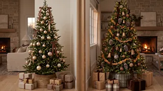
A brown-and-gold scheme can go wrong in two familiar ways: the tree looks too dark, or every ornament competes for attention. A few practical choices keep it balanced.
- Repeat colors at different heights. Place brown ribbon near the top, middle, and lower branches rather than concentrating it in one band. Do the same with gold ornaments.
- Mix shine with matte surfaces. Reflective gold looks brighter beside brushed metal, velvet, or wood. If every ornament is glossy, the tree can feel busy.
- Keep the topper in proportion. A simple star or bow works well. If the topper is elaborate, keep the ornaments below it quieter.
- Check the tree in daylight and at night. Brown can look nearly black in a dim corner. Warm lights and a lighter ribbon can help, but moving the tree closer to a window may be the better fix.
- Give the base a finish. A woven basket, neutral tree skirt, or simple fabric wrap can connect the tree to the room. Avoid adding another strong pattern if the ornaments already have plenty of detail.
For a rental or a small room, this palette is especially easy to adapt because it doesn’t depend on permanent changes. Use a compact tree, a few reusable ornaments, and ribbon that can be stored flat. If you’re decorating a shared space, repeat one or two colors in a nearby wreath or mantel arrangement rather than trying to match every surface.
Start With a Few Pieces You Love
You don’t need a cart full of new decorations to make this look work. Begin with one brown element, one gold finish, and a natural texture. Put them on the tree, switch on the lights, and see what the room needs. Maybe it’s a little more champagne gold to brighten a dark corner. Maybe it’s less ribbon and a few pinecones to make the whole thing feel relaxed.
Homestyler's roots trace back to Autodesk, the global leader in design and engineering software. That heritage lives on in every feature we build. Today, with a community of more than 20+ million registered users (platform data, 2026) worldwide, Homestyler continues to make professional-quality interior design accessible to everyone — from first-time decorators to seasoned architects.
That’s the appeal of a brown and gold Christmas tree: it can feel classic without looking copied from a catalog. Keep the colors connected to your room, vary the finishes, and leave a little green showing. If you want to test the arrangement against your existing furniture before you decorate, use Homestyler to explore the palette and proportions. Start with the ornaments you already own; the best version may be closer than you think.
Projete agora para LIVRE