| Palette | Best with | Easy accent |
|---|---|---|
| Forest green, ivory, and brass | Warm wood, cream walls, traditional rooms | Velvet ribbon or wooden beads |
| Red, green, and gold | Classic holiday decor and family heirlooms | Plaid ribbon or berry picks |
| White, silver, and icy blue | Cool neutrals and bright rooms | Clear glass ornaments |
| Burgundy, blush, and champagne | Warm neutrals and soft, layered interiors | Satin ribbon |
| Natural wood, cream, and rust | Rustic, relaxed rooms | Dried orange slices |
A tree can have beautiful ornaments and still feel a little chaotic. The fix is often not buying more decorations; it’s choosing a color scheme and letting it guide what goes on the branches. These Christmas tree decorating ideas by color scheme make it easier to create a tree that feels intentional, whether you love traditional red and green, quiet neutrals, or a bolder mix of jewel tones.
Start with ornaments you already own, then add one or two colors that pull them together. You don’t need a matching set or a perfectly styled living room. A clear palette simply gives your favorite pieces room to shine, and it makes shopping, arranging, and storing decorations much less of a guessing game.
Choose a palette that suits your room
Before you decorate, look at the colors already in the room. A tree doesn’t need to match the sofa, but it should feel at home beside it. If your living room is full of warm wood and cream textiles, icy blue and chrome may feel disconnected. A few repeated colors from the room—say, green, brass, and ivory—can make the tree feel like part of the space.
A useful starting point is the 60-30-10 rule: let one color dominate, use a second for contrast, and reserve a third for small accents. On a tree, that might mean green foliage and deep green ornaments as the base, ivory as the supporting color, and brass as the accent. The proportions don’t need to be exact. Think of them as a way to avoid giving every color equal visual weight.
Texture matters just as much as hue. Matte ornaments soften a shiny palette; velvet ribbon adds depth to simple glass balls; wood and felt make metallics feel less formal. I usually choose the main color first, then decide whether the tree needs warmth, sparkle, or a little contrast.


Christmas tree decorating ideas by color scheme: five palettes to try
These Christmas tree decorating ideas by color scheme are meant to work with real collections, not just a perfectly coordinated box of ornaments. Pick one palette, then use what you have as the starting point.
- Forest green, ivory, and brass
This combination feels classic without leaning heavily on red. Use ivory or cream ornaments to brighten the branches, then add brass bells or a few gold-toned baubles for warmth. A deep green velvet ribbon can echo the tree itself. It’s a good choice for rooms with wood furniture, warm lighting, or neutral upholstery.
Cost: Low if you already own gold or cream ornaments. Difficulty: Easy. Time: About 1–2 hours.
- Red, green, and gold
The familiar trio works best when you choose a dominant color instead of scattering all three evenly. Let red carry the strongest accents, keep green mostly in the tree and ribbon, and use gold sparingly to catch the light. If you have sentimental ornaments in several styles, this palette is forgiving: repeat red in a few places to make the mix feel connected.
Cost: Low to moderate. Difficulty: Easy. Time: 1–2 hours.
- White, silver, and icy blue
For a crisp, wintery look, combine matte white ornaments with silver and a smaller number of pale blue pieces. Clear glass ornaments help keep the branches visible, while warm-white lights stop the palette from feeling too cold. I’d skip adding too many different finishes; a few reflective pieces go further than a tree covered in glitter.
Cost: Moderate if you need new ornaments. Difficulty: Easy. Time: 1–2 hours.
- Burgundy, blush, and champagne
This palette is softer than traditional red and gold but still has enough depth to read as festive. Use burgundy as the anchor, blush as the lighter contrast, and champagne-colored accents for a subtle glow. Satin ribbon or fabric bows can make inexpensive baubles feel more considered. Keep the blush pieces spread around the tree rather than clustering them in one spot.
Cost: Moderate. Difficulty: Easy to moderate. Time: 2 hours.
- Natural wood, cream, and rust
Wooden beads, felt ornaments, dried orange slices, and simple cream baubles create a relaxed, handmade look. Rust-colored accents add warmth without competing with the natural materials. This is a practical palette if you want to mix in crafts or decorations collected over time. Use a few larger ornaments to keep the tree from looking too delicate or sparse.
Cost: Low to moderate, depending on what you make. Difficulty: Easy. Time: 1–3 hours.


Make the colors look balanced, not overly matched
A cohesive tree doesn’t mean every ornament has to come from the same collection. Repetition does the work. If you have a handful of red ornaments, place them at different heights and around different sides of the tree. Then repeat red in a ribbon, a small bow, or a few berry picks. The eye reads those echoes as a plan.
I like to decorate in layers. Put on the lights first, then add ribbon or garland, followed by larger ornaments and finally the smaller accents. Step back every few minutes. If one color is taking over, move a few pieces rather than adding a new color to “fix” it. That’s how a simple palette turns into a crowded one.
| If your tree feels… | Try this adjustment |
|---|---|
| Too dark | Add cream, white, or clear ornaments near the outer branches |
| Too shiny | Mix in matte finishes, wood, felt, or fabric |
| Too busy | Remove one accent color and repeat the remaining colors more evenly |
| Too sparse | Add ribbon or beads to create visual movement before buying more ornaments |
| Disconnected from the room | Repeat one or two colors already present in nearby textiles or furniture |
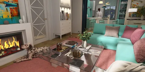
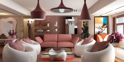
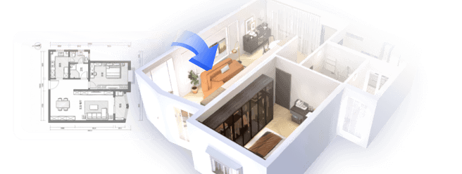
If you’re unsure whether a palette will work with the room, sketch out the tree and nearby furniture before you start. Homestyler can help you preview colors and proportions in a room layout, so you can test a warm metallic accent or a cooler blue before committing to a full set of decorations. Homestyler is most useful here as a planning aid; the actual tree can still be a happy mix of old favorites and new finds.


A few practical questions before you decorate
How many colors should I use?
Two main colors and one accent are a reliable starting point. You can add natural materials such as wood or greenery without treating them as another strong color. If your ornaments are already a mixed collection, choose two colors that appear most often and use them as the thread that ties everything together.
Do lights need to match the palette?
Not exactly, but their tone changes how the ornaments look. Warm-white lights flatter red, brass, cream, and wood. Cooler lights can suit silver and icy blue, though they may make a warm room feel stark. If you’re undecided, warm-white lights are usually the more forgiving choice.
What if I don’t want to buy new decorations?
Sort your ornaments by color and pull out the pieces that fit one palette. Use ribbon, paper-free natural accents, or simple fabric bows to fill gaps. A small number of repeated details often looks more deliberate than a large pile of new ornaments.
How do I store ornaments by color?
Keep fragile pieces in divided boxes and group them by palette or material. Add a note to the outside of the storage box if that helps next year, and wrap delicate ornaments in plain tissue or reusable fabric. Store ribbon loosely coiled so it doesn’t crease.
Start with the ornaments you love
The best palette is one you’ll enjoy seeing every day, not the one that looks most polished in a photo. Choose a main color, add a supporting shade, and use a third color only where you want the eye to land. Then work with the ornaments you already own. A few well-placed repeats can make a collection feel cohesive without hiding its personality.
Built on technology originally developed at Autodesk, Homestyler empowers anyone to design beautiful, realistic spaces in minutes. Join over 20+ million registered users (platform data, 2026) who have already discovered a smarter way to plan, visualize, and bring their dream homes to life — all from the comfort of a browser.
If you’re torn between two schemes, try a small test: decorate one section of the tree, step back, and see how it looks beside the room’s furniture and lighting. You can adjust before the whole tree is covered. For a quick way to compare colors and room proportions, plan the setup in Homestyler, then bring the palette to life with your own ornaments, ribbon, and keepsakes.
Projete agora para LIVRE