no more likes for now


DESIGNED WITH
Homestyler Floor Planner for Web
【System Auto-save】Untitled
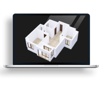
I decided to take a more simplistic yet traditional design to my I have 2 floors and a garage along with a small backyard. My main area is all open concept with the kitchen dining a dining room, I also have a bathroom and laundry room.Floor Plan 332.22㎡
i wanted to keep an open concept idea for the main floor but still have the privacy in the bathroom and laundry room. meanwhile on the second floor i kept a corridor small but still enough space to move around comfortably i put 3 bedrooms and one bathroom upstairs the three bedrooms are a nursery a
Space Showcase 26 Renders
OtherRoom
Bathroom

The bathroom here is the second floor bathroom I used a double sink as upstairs is where most the bedrooms are and I added marble tiling to the walls the plant adds colour to the bathroom and the bookshelf matches the same wood colour on the door.

this image shows the other side of the bathroom with the bathtub anf toiley it also shows a better angle of the mirror i used only one light in this room and let the natural light from the window i also kept a gold accents from downstairs into the bathroom witb the sink faucets some of the accessory
Bathroom
KidsRoom
Corridor

In this image I have part of the corridor I kept it simple with just a couple plants and a bench i used very little lights so that the natural light of the window could bring the most light into the house
OtherRoom

in this image it is mainly showing the stairs and how i used the same woof from the couch anf dining tables for th estairs so that it would all flow nicely together.

In this image you can see my kitchen and how I kept it simple and used the same wood from the couch dining table and stairs for the stools again so that it all flows nicely, and I still used plants for pops of colour

In this image it shows how the kitchen living room and dining room are open concept and how well they flow together in room

In this image I wanted to show how the natural lighting int the room increased the image of the pictures, so I put a lot of neutral tones with pops of colour on the couch and the plants.
Garage
SecondBedroom

This image is showing how the bed is the main focus of the room with it being all white with a cat on top to tie in all the pops of colour around the room.
MasterBedroom
This home design project - 【System Auto-save】Untitled was published on 2023-12-14 and was 100% designed by Homestyler floor planner, which includes 26 high quality photorealistic rendered images.
0 0 348
Updated:2023-12-14


